We found 1535 price guide item(s) matching your search
There are 1535 lots that match your search criteria. Subscribe now to get instant access to the full price guide service.
Click here to subscribe- List
- Grid
-
1535 item(s)/page

Lot 1259
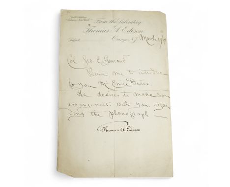
A handwritten letter signed by Thomas Edison on headed notepaper ‘ From the Laboratory of Thomas A. Edison, Orange, N.J., with Cable Address “ Edison, New York” to the top left corner and dated March 19th, 1889, The body of the letter in a different hand to the signature, reading;‘Col. Geo. E. Gounaud, permit me to introduce to you Mr. Emile Durer. He desires to make some arrangement with you regarding the phonograph. Thomas A. Edison
Lot 936
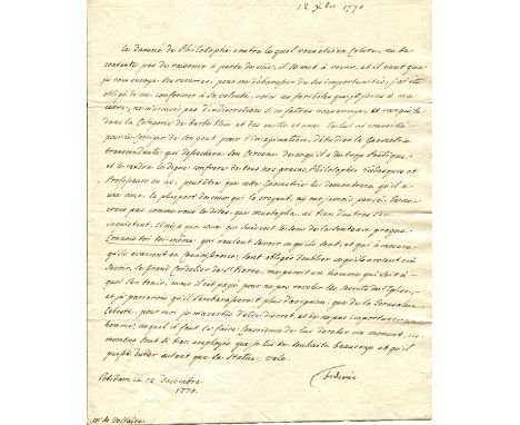
FREDERICK II: (1712-1786) King of Prussia 1740-86, known as Frederick The Great. A very rare autograph letter with extremely interesting content by the King of Prussia to Voltaire, A.L.S., `Frederic´, as King, one page, 4to, Postdam, 12th December 1770, to François-Marie Arouet, Voltaire, in French. At the time of this letter, the long and troubled relationship between Voltaire and Frederick II was already long-standing, dating back to 1736. After a period of great enthusiasm and mutual admiration, Voltaire returned from his two-year stay in Berlin disenchanted. Once the philosopher had settled in Switzerland, their correspondence resumed, with Voltaire even serving as an intermediary in the restoration of peace between France and Prussia during the Seven Years' War. The King starts his letter, referring to himself as "The Damned Philosopher", and in an amusing way and in the third person states in part `Le Damné de Philosophe contre lequel vous êtes en colère ne se contente pas de raisonner à perte de vue ; il se met à rêver, et il veut que je vous envoie ses rêveries. Pour me débarrasser de ses importunités, j’ai été obligé de me conformer à ses volontés. Voici ses fariboles, que je joins à ma lettre. Ne m’accusez pas d’indiscrétion. Si ce fatras vous ennuie, rangez-le dans la catégorie de Barbe-Bleue et des mille et une...´ (Translation: "The Damned Philosopher you're angry with doesn't just reason endlessly; he starts dreaming, and he wants me to send you his reveries. To get rid of his importunities, I was obliged to comply with his wishes. Here are his nonsense, which I enclose with my letter. Don't accuse me of indiscretion. If this jumble bores you, put it in the category of Bluebeard and the thousand and one..") Further Frederick II continues with this astonishing philosophical text which constitutes an allegory of the fight of the writers of the Enlightenment, led by Voltaire, against the "infamous", namely religion, saying `Je ne crois pas, comme vous le dites, que Moustapha ni bien d’autres s’en inquiètent. Il n’y a que ceux qui suivent le sens de la sentence grecque : "Connais-toi toi-même" qui veulent savoir ce qu’ils sont, et qui, à mesure qu’ils avancent en connaissances, sont obligés d’oublier ce qu’ils avaient cru savoir...´ (Translation: "I do not believe, as you say, that Mustafa or many others are concerned about this. Only those who follow the meaning of the Greek saying: "Know thyself" want to know what they are, and who, as they advance in knowledge, are obliged to forget what they thought they knew...") Further again, and before concluding, the King refers to the Church and religion, and do not forget Voltaire's fundamental lesson, which is to approach the most serious subjects with levity, and, consequently, smiles at himself and at what he presents as lucubrations, stating `Le Grand Cordelier de Saint-Pierre me paraît un homme qui sait à quoi s’en tenir ; mais il est payé pour ne pas révéler les secrets de l’Église, et je parierais qu’il s’embarrasserait beaucoup plus d’Avignon que de la Jérusalem céleste. Pour moi, je m’avertis d’être discret, et de ne pas importuner un homme auquel il faut se faire conscience de dérober un moment. Ses moments sont si bien employés que je lui en souhaite beaucoup, et qu’il puisse durer autant que sa statue...´ (Translation: "The Grand Cordelier of Saint-Pierre seems to me to be a man who knows what to expect; but he is paid not to reveal the secrets of the Church, and I would bet that he would be much more concerned with Avignon than with the heavenly Jerusalem. As for me, I warn myself to be discreet, and not to bother a man from whom one must be aware of stealing a moment. His moments are so well spent that I wish him many, and that he may last as long as his statue... ") An exceptionally interesting content letter by King Frederick II to his friend and old master Voltaire. With blank integral leaf. VG to EXVoltaire (1694-1778) François-Marie Arouet. French Enlightenment Writer and Philosopher.
Lot 38
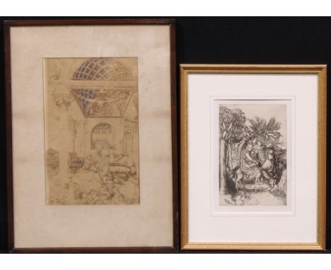
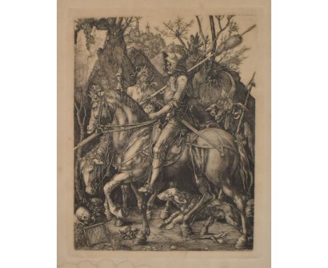
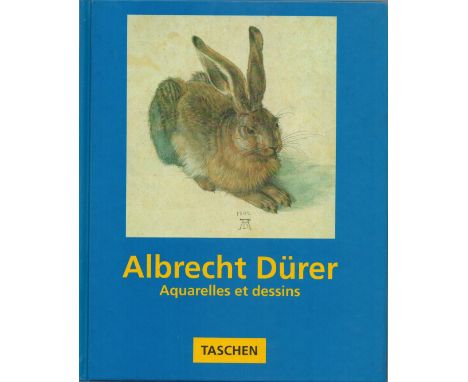
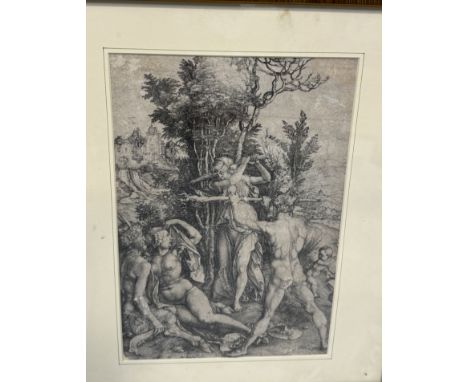
"A detailed print, an interesting drawing from a fascinating period — extremely rare.Albrecht Dürer (1471–1528)"Technique: Art print (Lithograph / Etching) Albrecht Durer (1471–1528) Dimensions without frame: 29 × 24.5 cm Dimensions including frame: 30.5 × 26 cm Provenance: Private collection, Israel Condition: For a detailed condition report, please email info@hammersite.com
Lot 291
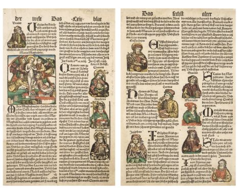
Schedel (Hartman, 1440 - 1515). Two printed leaves from the Nuremberg Chronicle: Das sechst alter der welt, Blat LXIX and LXXI, Nuremberg, circa 1493, black letter text in double-column, with hand-coloured woodcut illustrations to text, including Maria Magdalena, and various saints, together with five further leaves from Schedel's Weltchronik: a large woodcut of the Holy Family in the wilderness, 1496, German text to verso, a large woodcut of Eneas Pius der babst Friderich der dritt ein romischer kaiser, 1487 (by Durer or Hans Pleydenwurff), a hand-coloured titlepage from the Schedel Weltchronik, circa 1496-1500, a woodcut depicting the creation of Eve from Adam's rib, circa 1496 and a small woodcut illustration of the Burning of Rome, plus Cranach (Lukas, 1472-1553). Saint Matthew and the Angel, circa 1540, full-page woodcut illustration to verso of Die Bucher des Newen Testaments, gothic script, and Saint Paul writing at his desk, circa 1540, full-page woodcut, to verso of the first page of Romans: Die Epistel S. Pauli an die Romer, (both from the Luther Bible of circa 1540), plus a hand-coloured woodcut illustration depicting Christ brought before Caiaphas, from Koberger's Schatzbehalter, circa 1485, and another slightly smaller portion of a leaf from Koberger, Heiligen Legende, with hand-coloured woodcut illustration of the stoning of Saint StephenQTY: (11)
Lot 257
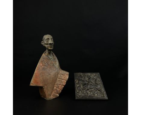
A BRONZE MODEL OF A DOG NUREMBERG, LATE 16TH CENTURY Modelled seated, turning, tongue lolling 9cm high, base 10cm wide This known model is similar in facture to an example in the Cleveland Museum of Art discussed at length by Wixom. The offered bronze is highly finished with great attention to detail. It is likely to belong to the "second group" identified by Wixom which were "modelled with lavish care", examples of which can be seen in Nuremberg, Munich and Vienna (Von Rho Collection). Hans Weihrauch assigns this second type to the Durer revival in Numemberg around 1600. See:See: "Renaissance Bronzes From Ohio Collections", Cleveland Museum of Art, William D Wixom 1975, P.180. Condition Report: The surface 90% a golden polished patina but with small areas of darker red visible to underside, and recesses, probably indictive of original early colour. Probably re-lacquered Mild surface scuffs and marks from handling Please see additional images for visual references to condition which form part of this condition report. All lots are available for inspection and Condition Reports are available on request. However, all lots are of an age and type which means that they may not be in perfect condition and should be viewed by prospective bidders; please refer to Condition 6 of the Conditions of Business for Buyers. This is particularly true for garden related items. All lots are offered for sale "as viewed" and subject to the applicable Conditions of Business for Buyer's condition, which are set out in the sale catalogue and are available on request. Potential buyers should note that condition reports are matters of opinion only, they are non-exhaustive and based solely on what can be seen to the naked eye unless otherwise specified by the cataloguer. We must advise you that we are not professional restorers or conservators and we do not provide any guarantee or warranty as to a lot's condition. Accordingly, it is recommended that prospective buyers inspect lots or have their advisors do so and satisfy themselves as to condition and accuracy of description. If you have physically viewed an item for which you request a report, the condition report cannot be a reason for cancelling a sale. Buyers are reminded that liability for loss and damage transfers to the buyer from the fall of the hammer. Whilst the majority of lots will remain in their location until collected, we can accept no responsibility for any damage which may occur, even in the event of Dreweatts staff assisting carriers during collection. Condition Report Disclaimer
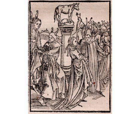
Lot 53
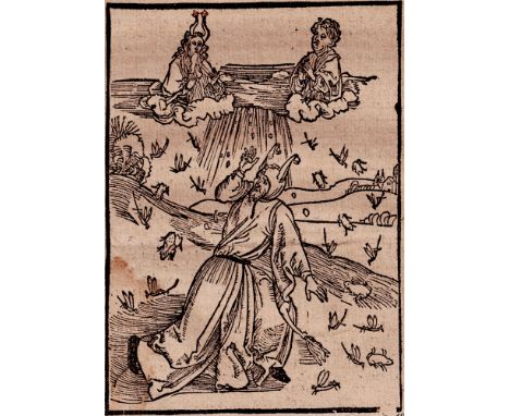
Albrecht Dürer - Dancing fools - 1494 / Description: Original Dürer woodcut from 1494. De choreis & saltationibus - Von Dantzen - Of Dancing: Woodcut made by the young Albrecht Durer in 1494 for Sebastian Brant's Stultifera navis - Das Narrenshiff. The Basel humanist Sebastian Brant described the sea journey of fools (representing the follies of human weakness and vice) to "Naragonia" the paradise of fools. The fine woodcut is the one commissioned for the first edition (in German) of 1494. This is one of the 75 of the 112 woodcuts now attributed to Dürer, who resided in Basel for a few months in 1494. "The woodcut illustrations created for the Das Narrenschiff are of immense density and tenseness. Since there was no iconographical tradition for this newly conceived text, the subjects and scenes of the illustrations had to be created entirely new. The images presented are of such convincing force that their equal in design had never before been seen" (A Heavenly Craft, p. 63). The woodcut here on auction from the Latin edition. / Dimensions: 11,80 x 8,40 cm / Condition: Very good black impression with unbroken borderlines. The woodcut is with side woodblock decoration and the Latin text on the full double sheet with the original text. / Literature: Schramm 1171, Rogner & Bernard 1376, Winkler 34 / Medium: Woodcut /Circa: 1494-1497
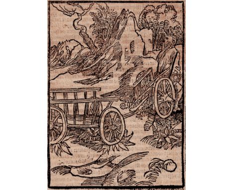
Lot 52
Albrecht Dürer - Cart puller Fool - the Road to Salvation - 1494 / Description: Original Dürer woodcut from 1494. De via fœlicitatis & futura pct?? p?na - Karrenziehernarr -Of the road to salvation: Woodcut made by the young Albrecht Durer in 1494 for Sebastian Brant's Stultifera navis - Das Narrenshiff. The Basel humanist Sebastian Brant described the sea journey of fools (representing the follies of human weakness and vice) to "Naragonia" the paradise of fools. The fine woodcut is the one commissioned for the first edition (in German) of 1494. This is one of the 75 of the 112 woodcuts now attributed to Dürer, who resided in Basel for a few months in 1494. "The woodcut illustrations created for the Das Narrenschiff are of immense density and tenseness. Since there was no iconographical tradition for this newly conceived text, the subjects and scenes of the illustrations had to be created entirely new. The images presented are of such convincing force that their equal in design had never before been seen" (A Heavenly Craft, p. 63). The woodcut here on auction from the Latin edition. / Dimensions: 11,80 x 8,40 cm / Condition: Very good black impression with unbroken borderlines. The woodcut is with side woodblock decoration and the Latin text on the full sheet with the original text. / Literature: Schramm 1158, Rogner & Bernard 1366 / Medium: Woodcut /Circa: 1494-1497
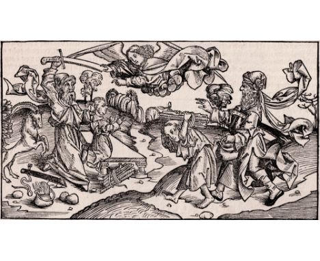
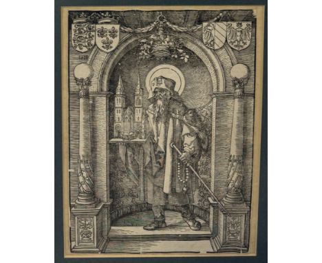
Lot 18
Michel Wolgemut (1434-1519) - The Sacrifice of Abraham and Isaac - 1493 / Description: Incunabula sheet from the German edition of Hartmann Schedel, "Liber Cronicarum" (Nuremberg Chronicle), printed by Anton Koberger in Nuremberg on 12 July 1493. The divine intervention of an angel preventing Abraham from sacrificing his son Isaac. A woodcut from Folio leaf XXII of the Chronicle. The Nuremberg Chronicle is the most extensively illustrated book, and one of the most important, of the 15th century. The text is a universal history of the Christian world from the beginning of time to the 1490's. Written in Latin by physician and humanist, Hartmann Schedel (1440-1514) on commission from Nuremberg merchants Sebald Schreye (1446-1520) and Sebastian Kammermeister (1446-1503). The Chronicle was printed by Nuremberg printer Anton Koberger (c.1440-1513), owner of the largest 15th-century German printing house. The Latin edition was printed in Koberger's shop between May 1492 and October 1493. In the meantime, a German translation was commissioned to George Alt (c.1450-1510), a scribe at the Nuremberg treasury, and the German edition was printed alongside the Latin one between January and December 1493. The Chronicle was illustrated by German artists Michael Wolgemut and Wilhelm Pleydenwurff, with the assistance of studio apprentices, including a young Albrecht Durer. / Dimensions: 12,50 x 22,35 cm / Condition: The woodcut has full borderlines and margins. It is doubled on another fragment of the Liber Cronicarume on the backside with the German text. Overall in very good condition. Overall in very good condition. / Literature: / Medium: Woodcut /Circa: 1493
Lot 54
Albrecht Dürer - Fool with God's punishments - 1494 / Description: Original Dürer woodcut from 1494. De plaga & indignatione dei - Of God's plagues and punishments: Woodcut made by the young Albrecht Durer in 1494 for Sebastian Brant's Stultifera navis - Das Narrenshiff. The Basel humanist Sebastian Brant described the sea journey of fools (representing the follies of human weakness and vice) to "Naragonia" the paradise of fools. The fine woodcut is the one commissioned for the first edition (in German) of 1494. This is one of the 75 of the 112 woodcuts now attributed to Dürer, who resided in Basel for a few months in 1494. "The woodcut illustrations created for the Das Narrenschiff are of immense density and tenseness. Since there was no iconographical tradition for this newly conceived text, the subjects and scenes of the illustrations had to be created entirely new. The images presented are of such convincing force that their equal in design had never before been seen" (A Heavenly Craft, p. 63). The woodcut here on auction from the Latin edition. / Dimensions: 11,80 x 8,40 cm / Condition: Very good black impression with unbroken borderlines. The woodcut is with side woodblock decoration and the Latin text on the full double sheet with the original text. / Literature: Schramm 1193, Rogner & Bernard 1393 / Medium: Woodcut /Circa: 1494-1497
Lot 50
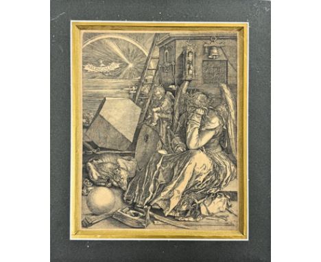
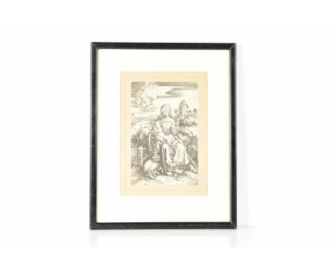
Albrecht Dürer, The Holy Trinity / Description: The Holy Trinity. Large woodcut made by Albrecht Durer (1471-1528) ca 1511. A very good strong impression (Meder 187 I from I), with a good watermark: fish bladder (Fishblase) with letters I M. Woodcut in excellent condition. Good strong impression on German laid watermarked paper with 2-6 mm margins. / Dimensions: 39,7 cm x 28,7 cm / Condition: Woodcut in excellent condition. Good strong impression, with all the details, on German laid watermarked paper with 2-6 mm margins. / Literature: Meder 187 I from I / Medium: woodcut /Circa: 1511
Lot 56
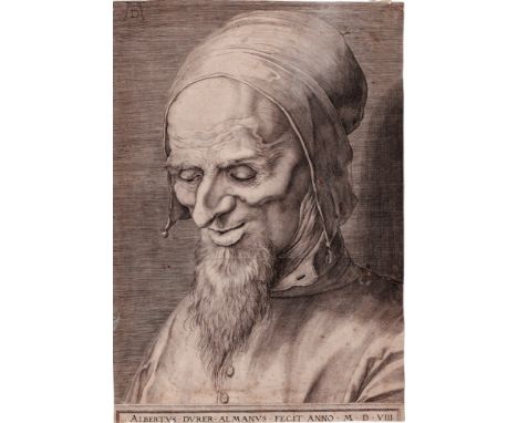
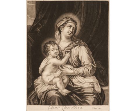
Aegidius Sadeler after Albrecht Dürer - Head of Apostle - 1598 / Description: Head of an apostle with a pointed beard and cap looking downwards. One of three studies of heads by Dürer engraved by Aegidius Sadeler in 1597 when he was employed as court engraver by Rudolf II in Prague, after the drawings by Durer then in the collection of the Emperor. Other engravings by Sadeler after Dürer (Hollstein 72, 77) indicate that Rudolf perhaps intended him to engrave all the Dürer drawings in his collection , but if so the work was not completed. / Dimensions: 32,50 x22,80 cm / Condition: A good impression of this larger work trimmed on the sides and top just within the image, trimmed just within the first line (of 3) of the footer title .Small marginal blemishes, a couple of pin holes, two small repaired tears in the margin on the left, slightly foxed. A larger impressive work showing Dürer's genius. / Literature: Hollstein / Dutch and Flemish etchings, engravings and woodcuts c.1450-1700 (87) / Medium: Engraving /Circa: 1598
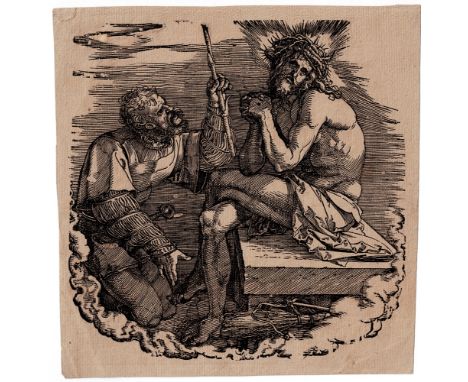
Lot 46
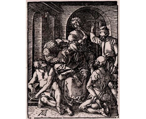
Albrecht Durer - The Mocking of Christ - C.1508-9 / Description: Meder 139 (b/c). Woodcut from the Small Passion by Dürer. Original Dürer woodcut from an early edition without text, dating from circa 1544 -1589 based on the fragment of watermark found on 'The Birth of Christ ' (see lot 'other' in this auction, watermark similar to the 'Kleines Wappen von Kaufburen mit einfachen Sternen =Meder Watermark 220.a, as used in the 'Ehrenporte' published in 1559.) the blindfolded Christ sitting in the center mocked by a group of henchmen. Original woodcut from circa 1508-1509 by Dürer from the small passion, his first major project, and today his most celebrated, depicting the final days of Christ’s life. / Dimensions: 12,70 x 9,80 cm / Condition: Excellent brilliant sharp and evenly printed well contrasted black impression with the gaps as described for this state. Early edition well ahead of the Italian text edition. On the full sheet of lead paper measuring 19,50 x 15,00 cm. Tipped with left border on a laid paper support sheet. A few spots in the margins, otherwise In an excellent untouched condition with no folds, tear or other stains. / Literature: Meder 139 (b/c) With the pushed in top right corner as described already for the very first impressions, with the defects at the right borderline as described for state b but before the pushed in bottom left corner as described for state 'C' ----- Bartsch / Le Peintre graveur (VII.120.30) ----- Dodgson 1903, 1911 / Catalogue of Early German and Flemish Woodcuts in the BM, 2 vols (I.296.74a) / Medium: Woodcut /Circa: 1508-1509
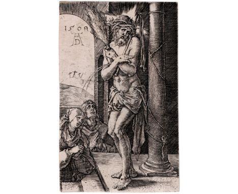
Lot 51
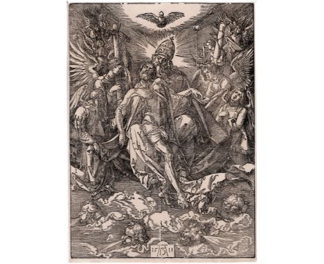
Albrecht Dürer, Christ as the Man of Sorrows standing by a column / Description: Christ as the Man of Sorrows standing by a column. At the left the Virgin Mary and Saint John. Title page of the rare series the 'Engraved Passion'. Engraving made by Albrecht Durer ca 1509. Albrecht Durer has chosen this engraving to start with in the engraved passion. References: Meder 3 A - B impression, Bartsch VII.33.3. A very good impression with all the details. In very good condition, printed on thin laid paper, on the margins image is complete. / Dimensions: 11,8 cm x 7,4 cm / Condition: A very good impression with all the details. In very good condition, printed on thin laid paper, on the margins image is complete. / Literature: Meder 3 A - B impression, Bartsch VII.33.3 / Medium: engraving /Circa: 1509
Lot 47
Albrecht Durer, Titlepage of the series of the Passion of Christ / Description: Title page of the series of the Passion of Christ. woodcut made by Albrecht Durer ca 1511. References: Meder 113 F from F. Title-page from a series of twelve woodcuts. A nice impression of this woodcut of Albrecht Dürer. In good condition, printed on laid paper with narrow margins. Collectors mark on the back. / Dimensions: 19,7 cm x 19,5 cm / Condition: A nice impression of this woodcut of Albrecht Dürer. In good condition, printed on laid paper with narrow margins. Collectors mark on the back. / Literature: Meder 113 F from F / Medium: woodcut /Circa: 1511
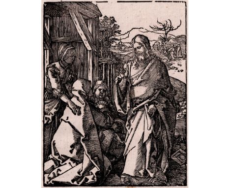
Lot 49
Albrecht Durer - Jesus Christ taking leave from his mother - C.1508 / Description: Meder 132 (a-c/c). Woodcut from the Small Passion by Dürer. Original Dürer woodcut from an early edition without text, dating from circa 1544 -1589 based on the fragment of watermark found on 'The Birth of Christ ' (see lot 'other' in this auction, watermark similar to the 'Kleines Wappen von Kaufburen mit einfachen Sternen =Meder Watermark 220.a, as used in the 'Ehrenporte' published in 1559.) Jesus Christ taking leave from his mother, with Christ standing on the right, his right hand raised in blessing, and three women gathering on the right. Original woodcut from circa 1508-9 by Dürer from the small passion, his first major project, and today his most celebrated, depicting the final days of Christ’s life. / Dimensions: 12,70 x 9,70 cm / Condition: Excellent brilliant sharp and evenly printed well contrasted black impression with the gaps in the top borderline as described for state 'a' but before the destruction of the bottom borderline described in state 'c'. Early edition well ahead of the Italian text edition. On the full sheet of lead paper measuring 19,50 x 15,00 cm. Tipped with left border on a laid paper support sheet. Some staining in the bottom margin away from the image, otherwise in an excellent untouched condition with no folds, tear or other stains. / Literature: Meder 132 a-c/c. With the gaps in the top borderline as already described for state 'a' but before the destruction of the bottom borderline described in state 'c'. --- Bartsch / Le Peintre graveur (VII.119.21) ----- Dodgson 1903, 1911 / Catalogue of Early German and Flemish Woodcuts in the BM, 2 vols (I.262.8) / Medium: Woodcut /Circa: 1508-1509
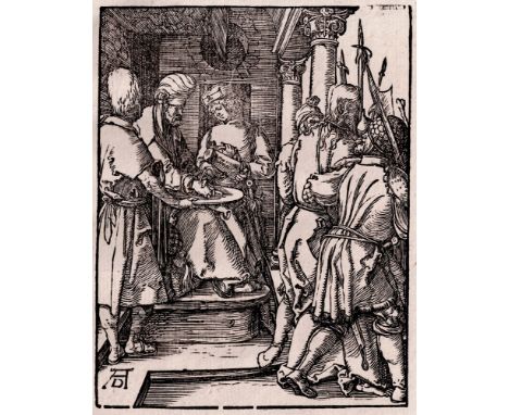
Lot 45
Albrecht Durer - Pilate washing his hands - C.1509 / Description: Meder 145 (d). Woodcut from the Small Passion by Dürer. Original Dürer woodcut from an early edition without text, dating from circa 1544 -1589 based on the fragment of watermark found on 'The Birth of Christ ' (see lot 'other' in this auction, watermark similar to the 'Kleines Wappen von Kaufburen mit einfachen Sternen =Meder Watermark 220.a, as used in the 'Ehrenporte' published in 1559.) on the left Pilate sitting on his throne and washing his hands, on the right Christ being lead away by henchmen. Original woodcut from circa 1509 by Dürer from the small passion, his first major project, and today his most celebrated, depicting the final days of Christ’s life. / Dimensions: 12,70 x 9,80 cm / Condition: Good sharp well contrasted black impression with the gaps upper right and bottom as described for this state but hard to say if it is 'c 'or 'd' from 'd'. Early edition well ahead of the Italian text edition. On the full sheet of lead paper measuring 19,50 x 15,00 cm. Tipped with left border on a laid paper support sheet. In an excellent untouched condition with no folds, tear or other stains. / Literature: Meder 145 (d/d) With the gaps in the top borderline as already described for state 'b' and with the four gaps in the bottom line but as described for state 'd' --- Bartsch / Le Peintre graveur (VII.120.36) ----- Dodgson 1903, 1911 / Catalogue of Early German and Flemish Woodcuts in the BM, 2 vols (I.262.7) / Medium: Woodcut /Circa: 1509
Lot 188
* Classical and Old Master Prints. A collection of approximately 170 prints, 17th - 19th century, etchings, mezzotints and engravings of classical and religious scenes, genre, landscapes and portraits, including the twelve apostles by Henry Overton, with examples by or after J. Smith, P. Canot, R. Earlom, F. Bartolozzi, J. Mason, P. Chenn, E. Cooper, W. Walker, J. Fitler, J. Scott, F. van Hoven, P. Angier, J. Reidinger and A. Durer, various sizes and conditionQTY: (approx. 170)
![Shaw (Richard Norman). Architectural Sketches from the Continent, London: Day & Son, [circa 1858], 100 illustrated plates](https://cdn.globalauctionplatform.com/f54f2524-23c5-4fce-851e-b2ab00b37c36/a9da6e56-0219-4cb0-980e-b2ae00f8565f/468x382.jpg)
Lot 345
Shaw (Richard Norman). Architectural Sketches from the Continent, London: Day & Son, [circa 1858], 100 illustrated plates, light spotting, contemporary ownership inscription to verso of front free endpaper, bookplate of George Aitchison, A. R. A. to front pastedown, contemporary half morocco by Riviere & Son, a little rubbed, corners bumped, folio, together with: Brooks (Samual H.). Designs for Cottage and Villa Architecture..., London: Thomas Kelly, [1839], numerous architectural illustrated plates, light spotting throughout, deaccession sticker of Sir John Soane's Museum, Staff Library 2008 to front free endpaper, lower hinge cracked, half purple morocco, covers stained, rubbed and worn, 4to, Weale (John). Quarterly Papers on Architecture, volume 1 (only), London: 59 High Holborn, 1844, coloured frontispiece, numerous architectural illustrated plates, some leaves spotted, contemporary ownership inscription to title, contemporary half calf, rubbed and worn, 4to, plus Divers Works of Early Masters of Christian Decoration: with an introduction containing the biography, Journal of Travel, Contemporaneous Association in Art, and a Critical Account of the works of Albert [sic] Durer..., volume 1 (only), London: W. Hughes, 1846, coloured frontispiece, additional engraved title, numerous illustrated plates (some folding), some spotting throughout, sewing perished and all gatherings loose, contemporary red half calf, rubbed and worn, folio QTY: (4)NOTE:George Aitchison RA (1825–1910) renowned English architect serving as the president of the Royal Institute of British Architects (RIBA) from 1890 to 1892.
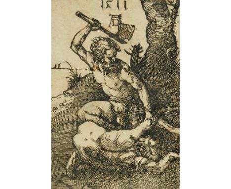
Lot 836
AFTER ALBRECHT DURERCain Killing Abel woodcut 11 x 8cm Provenance Private collection, UK Footnote This appears to be an 18th century printing and is probably a copy. Saleroom Notice Please note this is now believed to be After Durer, not fully attributed to him as previously catalogued.Condition reportSheet is taped in two places on the left hand border to the backing sheet; no margins; tiny loss to top right corner, a few areas of light staining, upper left. Under glass and held in a later frame.
Lot 230
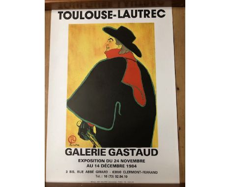
Vintage advertising posters, WW2 poster issued in Nazi occupied France for the National Lottery for health treatment, French 60s exhibition poster LES ENFANTS DE GRAND PAPA , 1970S German Exhibition poster for Albrecht Durer at the Gera Museum, advertising poster for Le Nouveau Beaujolais, Toulouse-Lautrec exhibition poster, Gus Bofa exhibition poster.
Lot 349
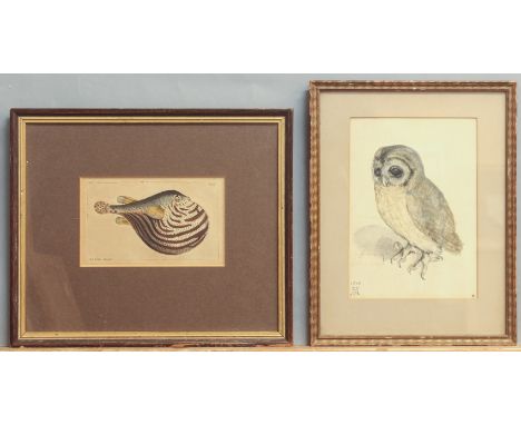
Four prints - including a Medici Society print of an Owl after Albrecht Durer, 18.8 x 13.2cm, gilt frame; a hand coloured engraving of a Fahaka Pufferfish, after R. P. Nodder, 8.1 x 13.7cm, wooden frame; a pair of hand coloured engravings of slugs and snails after R. P. Nodder, pub.1790, each 11.3 x 20cm, in a single wooden frame; and a (faded) still life in a wooden moulded frame, overall 37.75 x 31.5cm.
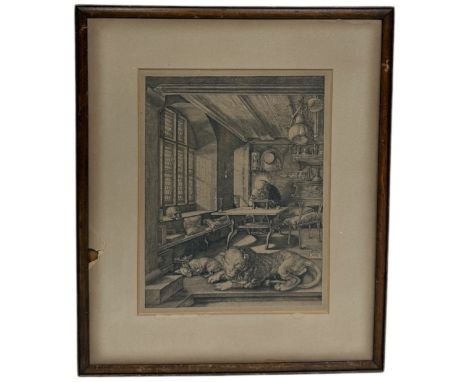
Lot 13
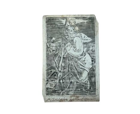
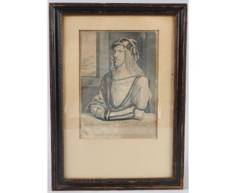
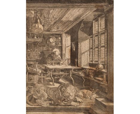
* Dürer (Albrecht, 1471-1528). Saint Jerome in His Study, 1514, engraving on laid paper, trimmed just inside the plate mark, an early (possibly 16th century) impression, some staining and several small tears repaired, generally without loss, sheet size 240 x 185 mm (9 1/2 x 7 1/4 ins), laid down on early 19th century English backing card, with ruled outer border in brown ink and pale brown wash, inscribed in ink to foot of the backing sheet 'Etching by Albert Durer - the Picture by the same Artist at Powerscourt', together with Jan Wierix (circa 1549-1615). Melencolia I, after Albrecht Dürer, 1602 [but later], engraving on wove paper, a good impression from a later printing (probably late 18th century or early 19th century), trimmed to plate margin, sheet size 239 x 190 mm (9 1/2 x 7 1/2 ins), plus two other later engravings after Dürer, including The Virgin Seated on a Grassy Bank, 1566, published by Claes Jansz. Visscher, engraving on antique laid paper, trimmed to plate margin, sheet size 116 x 72 mmQTY: (4)NOTE:Saint Jerome: Meder 59. Wierix: Mauquoy-Hendrickx, Estampes des Wierix 1556; Hollstein 2000; Alvin 1576. Virgin Seated on a Grassy Bank: Bartsch 34, Meder 31.
Lot 52
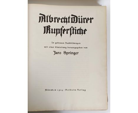
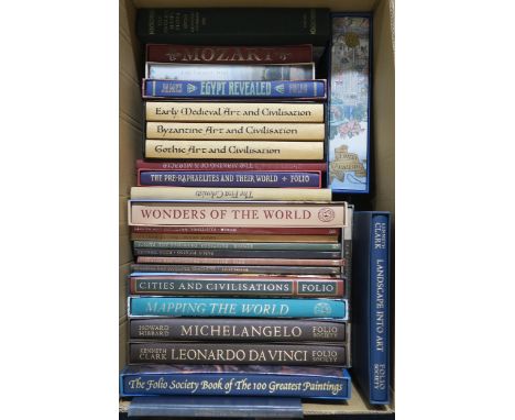
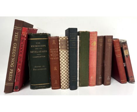
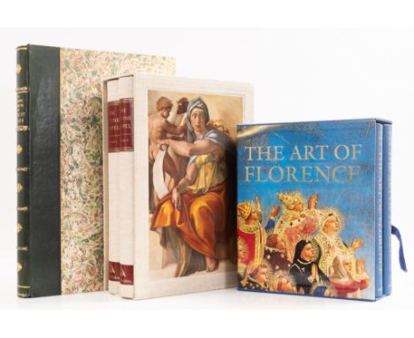
Kurth (Dr Willi, editor) The Complete Woodcuts of Albrecht Durer, with an introduction by Campbell Dodgson, one of 500 copies, illustrations, modern morocco-backed marbled boards, spine gilt, small scuff to foot of spine, 1927 § Hartt (Frederick) & others. The Sistine Chapel, 2 vol., one of 500 copies, 1991 § Andres (Glenn M.) & others. The Art of Florence, 2 vol., 1994, the last two with colour illustrations, some folding, original cloth with slip-cases, folio & 4to (5)
Lot 1001
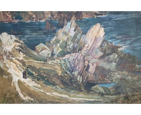
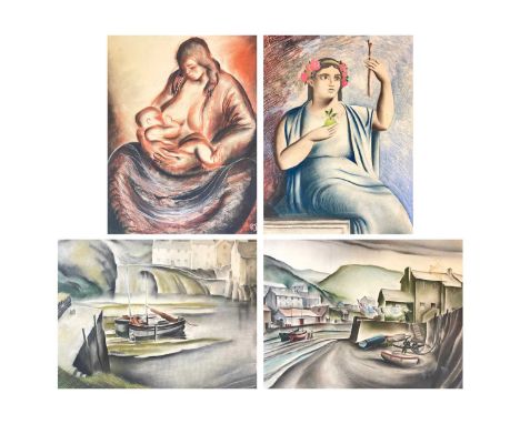
Frederick ROBERTS JOHNSON (1900-1986) The Net Loft, Polperro Oil on board, 61cm x 90cm, 67cm x 96cm framed. Frederick Roberts Johnson and Arthur Wragg, two friends who met whilst training to become commercial artists, moved together to Polperro in 1924, staying at 'The House on the Props'. They had somewhat contrasting styles which somehow sometimes overlapped; Wragg's style was likened to David Low and Victor 'Vicky Weisz, sharing within his lifetime the same respect and public interest as the two aforementioned. His work was also regularly compared to that of Aubrey Beardsley, though Wragg's own heroes were Cruickshank, Albrecht Durer and William Blake, the latter being someone he was also compared to within his lifetime. Wragg's first book was hugely successful, having to be reprinted three times in one year and it became Book of The Year in America.Frederick Roberts Johnson was a very succesful commercial artist and was often the one who usually went to London in search of commissions for the pair. He often used the name 'Essex' or 'Sax', drawing funnies for Punch, Everyman magazine and Tribune, as well as advertisements for Lyons Tea Shops and producing dustjacket book illustrations for various authors. His style was more varied and experimental, with impressionism, cubism and abstract examples of his work within the sale.
Lot 1064
Frederick ROBERTS JOHNSON (1900-1986) House on Props, Polperro Pastel on paper, signed, 30.5cm x 22cm, 47.5cm x 39cm framed.Frederick Roberts Johnson and Arthur Wragg, two friends who met whilst training to become commercial artists, moved together to Polperro in 1924, staying at 'The House on the Props'. They had somewhat contrasting styles which somehow sometimes overlapped; Wragg's style was likened to David Low and Victor 'Vicky Weisz, sharing within his lifetime the same respect and public interest as the two aforementioned. His work was also regularly compared to that of Aubrey Beardsley, though Wragg's own heroes were Cruickshank, Albrecht Durer and William Blake, the latter being someone he was also compared to within his lifetime. Wragg's first book was hugely successful, having to be reprinted three times in one year and it became Book of The Year in America.Frederick Roberts Johnson was a very succesful commercial artist and was often the one who usually went to London in search of commissions for the pair. He often used the name 'Essex' or 'Sax', drawing funnies for Punch, Everyman magazine and Tribune, as well as advertisements for Lyons Tea Shops and producing dustjacket book illustrations for various authors. His style was more varied and experimental, with impressionism, cubism and abstract examples of his work within the sale.
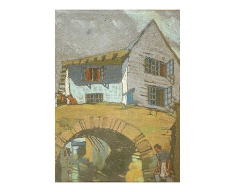
Lot 1158
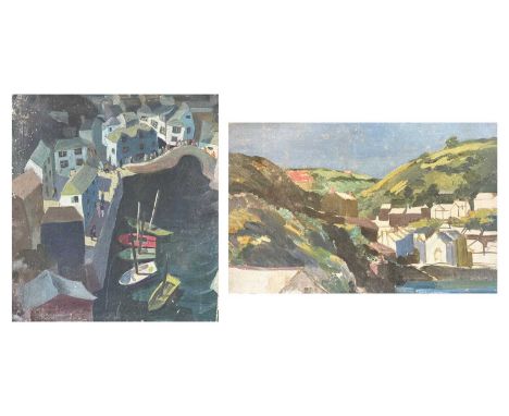
Frederick ROBERTS JOHNSON (1900-1986) Stylized Polperro Oil on board, 43.5cm x 72cm.Frederick Roberts Johnson and Arthur Wragg, two friends who met whilst training to become commercial artists, moved together to Polperro in 1924, staying at 'The House on the Props'. They had somewhat contrasting styles which somehow sometimes overlapped; Wragg's style was likened to David Low and Victor 'Vicky Weisz, sharing within his lifetime the same respect and public interest as the two aforementioned. His work was also regularly compared to that of Aubrey Beardsley, though Wragg's own heroes were Cruickshank, Albrecht Durer and William Blake, the latter being someone he was also compared to within his lifetime. Wragg's first book was hugely successful, having to be reprinted three times in one year and it became Book of The Year in America.Frederick Roberts Johnson was a very succesful commercial artist and was often the one who usually went to London in search of commissions for the pair. He often used the name 'Essex' or 'Sax', drawing funnies for Punch, Everyman magazine and Tribune, as well as advertisements for Lyons Tea Shops and producing dustjacket book illustrations for various authors. His style was more varied and experimental, with impressionism, cubism and abstract examples of his work within the sale.
Lot 1208
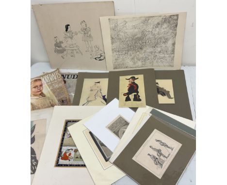
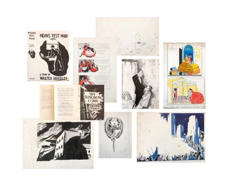
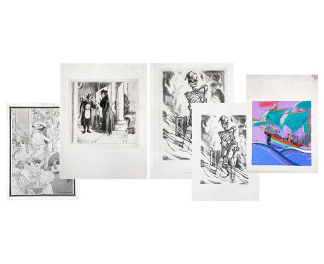
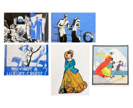
Arthur WRAGG (1903-1976) A portfolio of work including for Woman's Journal and Woman's Pictorial Mainly ink or graphite on board or paper, toegther with letters written to the illustrator, numerous dust jackets for 'Thy Kingdom Come' and other ephemera.Frederick Roberts Johnson and Arthur Wragg, two friends who met whilst training to become commercial artists, moved together to Polperro in 1924, staying at 'The House on the Props'. They had somewhat contrasting styles which somehow sometimes overlapped; Wragg's style was likened to David Low and Victor 'Vicky Weisz, sharing within his lifetime the same respect and public interest as the two aforementioned. His work was also regularly compared to that of Aubrey Beardsley, though Wragg's own heroes were Cruickshank, Albrecht Durer and William Blake, the latter being someone he was also compared to within his lifetime. Wragg's first book was hugely successful, having to be reprinted three times in one year and it became Book of The Year in America.Frederick Roberts Johnson was a very succesful commercial artist and was often the one who usually went to London in search of commissions for the pair. He often used the name 'Essex' or 'Sax', drawing funnies for Punch, Everyman magazine and Tribune, as well as advertisements for Lyons Tea Shops and producing dustjacket book illustrations for various authors. His style was more varied and experimental, with impressionism, cubism and abstract examples of his work within the sale.
Lot 1166
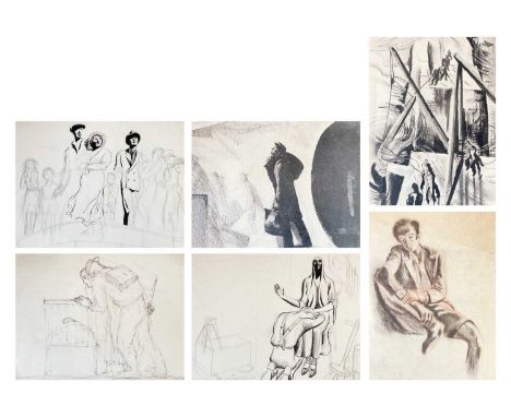
Arthur WRAGG (1903-1976) Thirteen Sketches and Studies Mixed media, including pen and ink and graphite, each unsigned, largest 45cm x 58cm.Frederick Roberts Johnson and Arthur Wragg, two friends who met whilst training to become commercial artists, moved together to Polperro in 1924, staying at 'The House on the Props'. They had somewhat contrasting styles which somehow sometimes overlapped; Wragg's style was likened to David Low and Victor 'Vicky Weisz, sharing within his lifetime the same respect and public interest as the two aforementioned. His work was also regularly compared to that of Aubrey Beardsley, though Wragg's own heroes were Cruickshank, Albrecht Durer and William Blake, the latter being someone he was also compared to within his lifetime. Wragg's first book was hugely successful, having to be reprinted three times in one year and it became Book of The Year in America.Frederick Roberts Johnson was a very succesful commercial artist and was often the one who usually went to London in search of commissions for the pair. He often used the name 'Essex' or 'Sax', drawing funnies for Punch, Everyman magazine and Tribune, as well as advertisements for Lyons Tea Shops and producing dustjacket book illustrations for various authors. His style was more varied and experimental, with impressionism, cubism and abstract examples of his work within the sale.
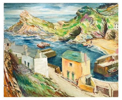
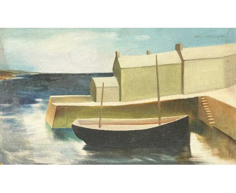
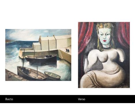
Lot 1005
Frederick ROBERTS JOHNSON (1900-1986) Sunny Day, Polperro Oil on board, 61cm x 74cm.Frederick Roberts Johnson and Arthur Wragg, two friends who met whilst training to become commercial artists, moved together to Polperro in 1924, staying at 'The House on the Props'. They had somewhat contrasting styles which somehow sometimes overlapped; Wragg's style was likened to David Low and Victor 'Vicky Weisz, sharing within his lifetime the same respect and public interest as the two aforementioned. His work was also regularly compared to that of Aubrey Beardsley, though Wragg's own heroes were Cruickshank, Albrecht Durer and William Blake, the latter being someone he was also compared to within his lifetime. Wragg's first book was hugely successful, having to be reprinted three times in one year and it became Book of The Year in America.Frederick Roberts Johnson was a very succesful commercial artist and was often the one who usually went to London in search of commissions for the pair. He often used the name 'Essex' or 'Sax', drawing funnies for Punch, Everyman magazine and Tribune, as well as advertisements for Lyons Tea Shops and producing dustjacket book illustrations for various authors. His style was more varied and experimental, with impressionism, cubism and abstract examples of his work within the sale.
Lot 1209
Frederick ROBERTS JOHNSON (1900-1986) Five Works Mixed media, including watercolour and pastel, two signed, 'International Test Match', 37cm x 27cm.Frederick Roberts Johnson and Arthur Wragg, two friends who met whilst training to become commercial artists, moved together to Polperro in 1924, staying at 'The House on the Props'. They had somewhat contrasting styles which somehow sometimes overlapped; Wragg's style was likened to David Low and Victor 'Vicky Weisz, sharing within his lifetime the same respect and public interest as the two aforementioned. His work was also regularly compared to that of Aubrey Beardsley, though Wragg's own heroes were Cruickshank, Albrecht Durer and William Blake, the latter being someone he was also compared to within his lifetime. Wragg's first book was hugely successful, having to be reprinted three times in one year and it became Book of The Year in America.Frederick Roberts Johnson was a very succesful commercial artist and was often the one who usually went to London in search of commissions for the pair. He often used the name 'Essex' or 'Sax', drawing funnies for Punch, Everyman magazine and Tribune, as well as advertisements for Lyons Tea Shops and producing dustjacket book illustrations for various authors. His style was more varied and experimental, with impressionism, cubism and abstract examples of his work within the sale.
Lot 1075
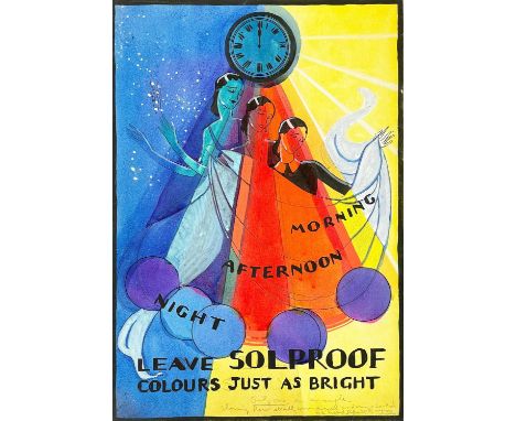
Arthur WRAGG (1903-1976) An illustration for Solpruff Fadeless Fabrics Watercolour and ink, graphite inscription, 38cm x 26.5cm.Frederick Roberts Johnson and Arthur Wragg, two friends who met whilst training to become commercial artists, moved together to Polperro in 1924, staying at 'The House on the Props'. They had somewhat contrasting styles which somehow sometimes overlapped; Wragg's style was likened to David Low and Victor 'Vicky Weisz, sharing within his lifetime the same respect and public interest as the two aforementioned. His work was also regularly compared to that of Aubrey Beardsley, though Wragg's own heroes were Cruickshank, Albrecht Durer and William Blake, the latter being someone he was also compared to within his lifetime. Wragg's first book was hugely successful, having to be reprinted three times in one year and it became Book of The Year in America.Frederick Roberts Johnson was a very succesful commercial artist and was often the one who usually went to London in search of commissions for the pair. He often used the name 'Essex' or 'Sax', drawing funnies for Punch, Everyman magazine and Tribune, as well as advertisements for Lyons Tea Shops and producing dustjacket book illustrations for various authors. His style was more varied and experimental, with impressionism, cubism and abstract examples of his work within the sale.
Lot 1085
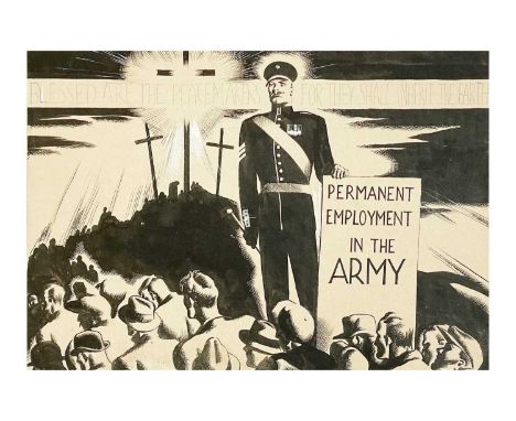
Arthur WRAGG (1903-1976) Disaffection From Wragg's book 'Jesus Wept' Pen and ink, titled, with graphite inscription and notes regarding the font type to use for the finished publication, 22cm x 31.5cm.Frederick Roberts Johnson and Arthur Wragg, two friends who met whilst training to become commercial artists, moved together to Polperro in 1924, staying at 'The House on the Props'. They had somewhat contrasting styles which somehow sometimes overlapped; Wragg's style was likened to David Low and Victor 'Vicky Weisz, sharing within his lifetime the same respect and public interest as the two aforementioned. His work was also regularly compared to that of Aubrey Beardsley, though Wragg's own heroes were Cruickshank, Albrecht Durer and William Blake, the latter being someone he was also compared to within his lifetime. Wragg's first book was hugely successful, having to be reprinted three times in one year and it became Book of The Year in America.Frederick Roberts Johnson was a very succesful commercial artist and was often the one who usually went to London in search of commissions for the pair. He often used the name 'Essex' or 'Sax', drawing funnies for Punch, Everyman magazine and Tribune, as well as advertisements for Lyons Tea Shops and producing dustjacket book illustrations for various authors. His style was more varied and experimental, with impressionism, cubism and abstract examples of his work within the sale.
Lot 1097
Frederick ROBERTS JOHNSON (1900-1986) Polperro Oil on board, 61cm x 76cm, with portrait study verso.Frederick Roberts Johnson and Arthur Wragg, two friends who met whilst training to become commercial artists, moved together to Polperro in 1924, staying at 'The House on the Props'. They had somewhat contrasting styles which somehow sometimes overlapped; Wragg's style was likened to David Low and Victor 'Vicky Weisz, sharing within his lifetime the same respect and public interest as the two aforementioned. His work was also regularly compared to that of Aubrey Beardsley, though Wragg's own heroes were Cruickshank, Albrecht Durer and William Blake, the latter being someone he was also compared to within his lifetime. Wragg's first book was hugely successful, having to be reprinted three times in one year and it became Book of The Year in America.Frederick Roberts Johnson was a very succesful commercial artist and was often the one who usually went to London in search of commissions for the pair. He often used the name 'Essex' or 'Sax', drawing funnies for Punch, Everyman magazine and Tribune, as well as advertisements for Lyons Tea Shops and producing dustjacket book illustrations for various authors. His style was more varied and experimental, with impressionism, cubism and abstract examples of his work within the sale.
Lot 1082
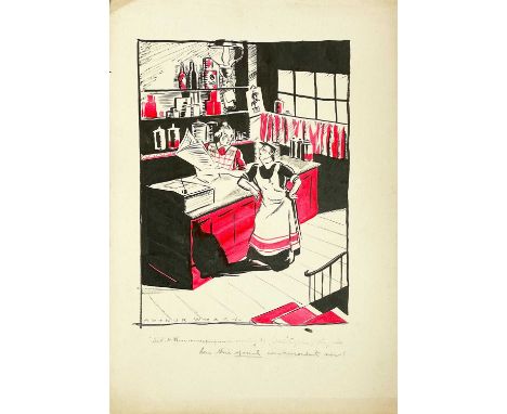
Arthur WRAGG (1903-1976) What These Newspapers Is Coming To Watercolour and ink, signed, inscribed ' What these newspapers is coming to, Mrs ....., they all has their official co-respondent now!'', 54cm x 38cm.Frederick Roberts Johnson and Arthur Wragg, two friends who met whilst training to become commercial artists, moved together to Polperro in 1924, staying at 'The House on the Props'. They had somewhat contrasting styles which somehow sometimes overlapped; Wragg's style was likened to David Low and Victor 'Vicky Weisz, sharing within his lifetime the same respect and public interest as the two aforementioned. His work was also regularly compared to that of Aubrey Beardsley, though Wragg's own heroes were Cruickshank, Albrecht Durer and William Blake, the latter being someone he was also compared to within his lifetime. Wragg's first book was hugely successful, having to be reprinted three times in one year and it became Book of The Year in America.Frederick Roberts Johnson was a very succesful commercial artist and was often the one who usually went to London in search of commissions for the pair. He often used the name 'Essex' or 'Sax', drawing funnies for Punch, Everyman magazine and Tribune, as well as advertisements for Lyons Tea Shops and producing dustjacket book illustrations for various authors. His style was more varied and experimental, with impressionism, cubism and abstract examples of his work within the sale.
Lot 1129
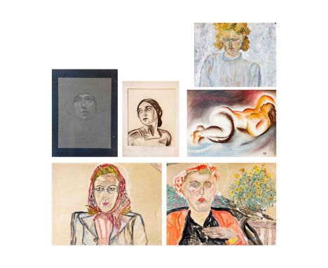
Frederick ROBERTS JOHNSON (1900-1986) Six Original Works Two portrait studies, pastel and charcoal, together with a pastel study of a female nude in repose, initialled RJ, 45.5cm x 58.5cm and three further female portrait studies (6)Frederick Roberts Johnson and Arthur Wragg, two friends who met whilst training to become commercial artists, moved together to Polperro in 1924, staying at 'The House on the Props'. They had somewhat contrasting styles which somehow sometimes overlapped; Wragg's style was likened to David Low and Victor 'Vicky Weisz, sharing within his lifetime the same respect and public interest as the two aforementioned. His work was also regularly compared to that of Aubrey Beardsley, though Wragg's own heroes were Cruickshank, Albrecht Durer and William Blake, the latter being someone he was also compared to within his lifetime. Wragg's first book was hugely successful, having to be reprinted three times in one year and it became Book of The Year in America.Frederick Roberts Johnson was a very succesful commercial artist and was often the one who usually went to London in search of commissions for the pair. He often used the name 'Essex' or 'Sax', drawing funnies for Punch, Everyman magazine and Tribune, as well as advertisements for Lyons Tea Shops and producing dustjacket book illustrations for various authors. His style was more varied and experimental, with impressionism, cubism and abstract examples of his work within the sale.
Lot 1123
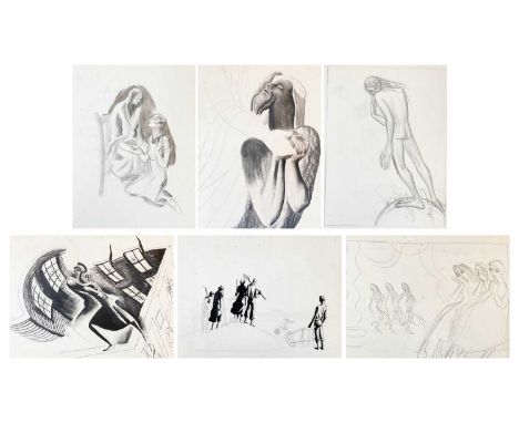
Arthur WRAGG (1903-1976) A portfolio of studies, preporatory sketches and ideas and partly finished works, all unsigned, largest 58cm x 42cm.Frederick Roberts Johnson and Arthur Wragg, two friends who met whilst training to become commercial artists, moved together to Polperro in 1924, staying at 'The House on the Props'. They had somewhat contrasting styles which somehow sometimes overlapped; Wragg's style was likened to David Low and Victor 'Vicky Weisz, sharing within his lifetime the same respect and public interest as the two aforementioned. His work was also regularly compared to that of Aubrey Beardsley, though Wragg's own heroes were Cruickshank, Albrecht Durer and William Blake, the latter being someone he was also compared to within his lifetime. Wragg's first book was hugely successful, having to be reprinted three times in one year and it became Book of The Year in America.Frederick Roberts Johnson was a very succesful commercial artist and was often the one who usually went to London in search of commissions for the pair. He often used the name 'Essex' or 'Sax', drawing funnies for Punch, Everyman magazine and Tribune, as well as advertisements for Lyons Tea Shops and producing dustjacket book illustrations for various authors. His style was more varied and experimental, with impressionism, cubism and abstract examples of his work within the sale.
Lot 1146
Arthur WRAGG (1903-1976) Five Works Mixed media, including cruise advertising imagery and 'The Promenade (1860), mixed media, signed, 30cm x 26cm.Frederick Roberts Johnson and Arthur Wragg, two friends who met whilst training to become commercial artists, moved together to Polperro in 1924, staying at 'The House on the Props'. They had somewhat contrasting styles which somehow sometimes overlapped; Wragg's style was likened to David Low and Victor 'Vicky Weisz, sharing within his lifetime the same respect and public interest as the two aforementioned. His work was also regularly compared to that of Aubrey Beardsley, though Wragg's own heroes were Cruickshank, Albrecht Durer and William Blake, the latter being someone he was also compared to within his lifetime. Wragg's first book was hugely successful, having to be reprinted three times in one year and it became Book of The Year in America.Frederick Roberts Johnson was a very succesful commercial artist and was often the one who usually went to London in search of commissions for the pair. He often used the name 'Essex' or 'Sax', drawing funnies for Punch, Everyman magazine and Tribune, as well as advertisements for Lyons Tea Shops and producing dustjacket book illustrations for various authors. His style was more varied and experimental, with impressionism, cubism and abstract examples of his work within the sale.
Lot 1119
Frederick ROBERTS JOHNSON (1900-1986) Four Works Two styalized views of Polperro, each pastel on paper, 51cm x 63.5cm; together with two pastel portraits, one initialled RJ.Frederick Roberts Johnson and Arthur Wragg, two friends who met whilst training to become commercial artists, moved together to Polperro in 1924, staying at 'The House on the Props'. They had somewhat contrasting styles which somehow sometimes overlapped; Wragg's style was likened to David Low and Victor 'Vicky Weisz, sharing within his lifetime the same respect and public interest as the two aforementioned. His work was also regularly compared to that of Aubrey Beardsley, though Wragg's own heroes were Cruickshank, Albrecht Durer and William Blake, the latter being someone he was also compared to within his lifetime. Wragg's first book was hugely successful, having to be reprinted three times in one year and it became Book of The Year in America.Frederick Roberts Johnson was a very succesful commercial artist and was often the one who usually went to London in search of commissions for the pair. He often used the name 'Essex' or 'Sax', drawing funnies for Punch, Everyman magazine and Tribune, as well as advertisements for Lyons Tea Shops and producing dustjacket book illustrations for various authors. His style was more varied and experimental, with impressionism, cubism and abstract examples of his work within the sale.
Lot 1161
Frederick ROBERTS JOHNSON (1900-1986) Two Polperro Views Each oil on board, 30cm x 28cm and 26cm x 41cm. Frederick Roberts Johnson and Arthur Wragg, two friends who met whilst training to become commercial artists, moved together to Polperro in 1924, staying at 'The House on the Props'. They had somewhat contrasting styles which somehow sometimes overlapped; Wragg's style was likened to David Low and Victor 'Vicky Weisz, sharing within his lifetime the same respect and public interest as the two aforementioned. His work was also regularly compared to that of Aubrey Beardsley, though Wragg's own heroes were Cruickshank, Albrecht Durer and William Blake, the latter being someone he was also compared to within his lifetime. Wragg's first book was hugely successful, having to be reprinted three times in one year and it became Book of The Year in America.Frederick Roberts Johnson was a very succesful commercial artist and was often the one who usually went to London in search of commissions for the pair. He often used the name 'Essex' or 'Sax', drawing funnies for Punch, Everyman magazine and Tribune, as well as advertisements for Lyons Tea Shops and producing dustjacket book illustrations for various authors. His style was more varied and experimental, with impressionism, cubism and abstract examples of his work within the sale.
-
1535 item(s)/page